

zero zero app.
Zero Zero App.
Dreamt out of one of those moments, while camping in my old VW with my twin boys, extended family, and our pack of dogs, I realised how much we take from the planet without even noticing — even something as simple as wild camping has a hidden carbon cost.
We waste so much.
Use less, more.

use less, more.

This sparked a bigger idea: what if people could see the real impact of their daily choices, and just as importantly, be rewarded for doing better?
Zero Zero is my answer to that question — a tool that makes sustainability simple, personal, and even joyful.

Key challenges included:
Translating a broad vision into a clear, user-friendly app.
Designing a seamless user journey that integrated AI, GPS, and carbon tracking technologies.
Crafting a brand identity that resonated with eco-conscious users and investors alike.
Developing an MVP (Minimum Viable Product) that balanced ambition with practicality.
The Process.
1. Discovery & Ideation.
I began with an in-depth discovery phase, including workshops and collaborative brainstorming sessions with the Re-Wilders. Together, we:
Defined the core user personas, focusing on eco-conscious individuals and those seeking to balance financial, environmental, and personal well-being.
Mapped out key user journeys, ensuring simplicity and clarity at every step.
Conducted competitive research to understand gaps in the market and identify opportunities to stand out.
2. Branding & Design.
With a deep understanding of Zero Zero’s mission, I crafted a bold and striking brand identity. Key elements included:
Visual Design: A modern aesthetic that captured the essence of sustainability and innovation.
Typography and Color Palette: Minimalist yet impactful, using clean lines and earthy tones.
Tagline Development: "Use Less, More" became the rallying cry, encapsulating the app’s ethos in just three words.
3. UX/UI Development
I designed a lean and intuitive interface that prioritised ease of use while incorporating complex functionalities like:
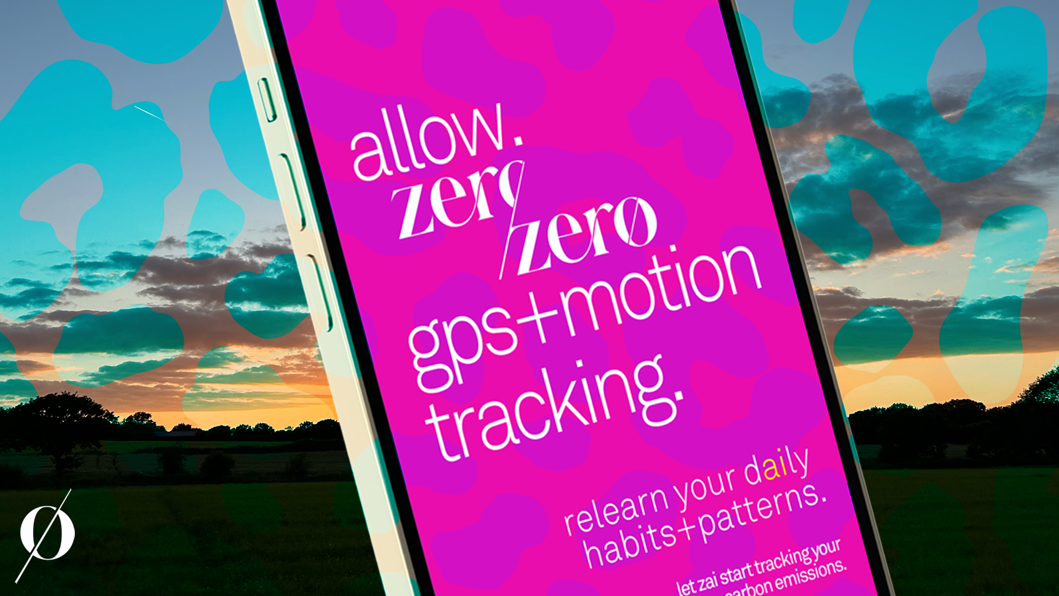
AI Integration: Providing personalised recommendations based on user habits and patterns.
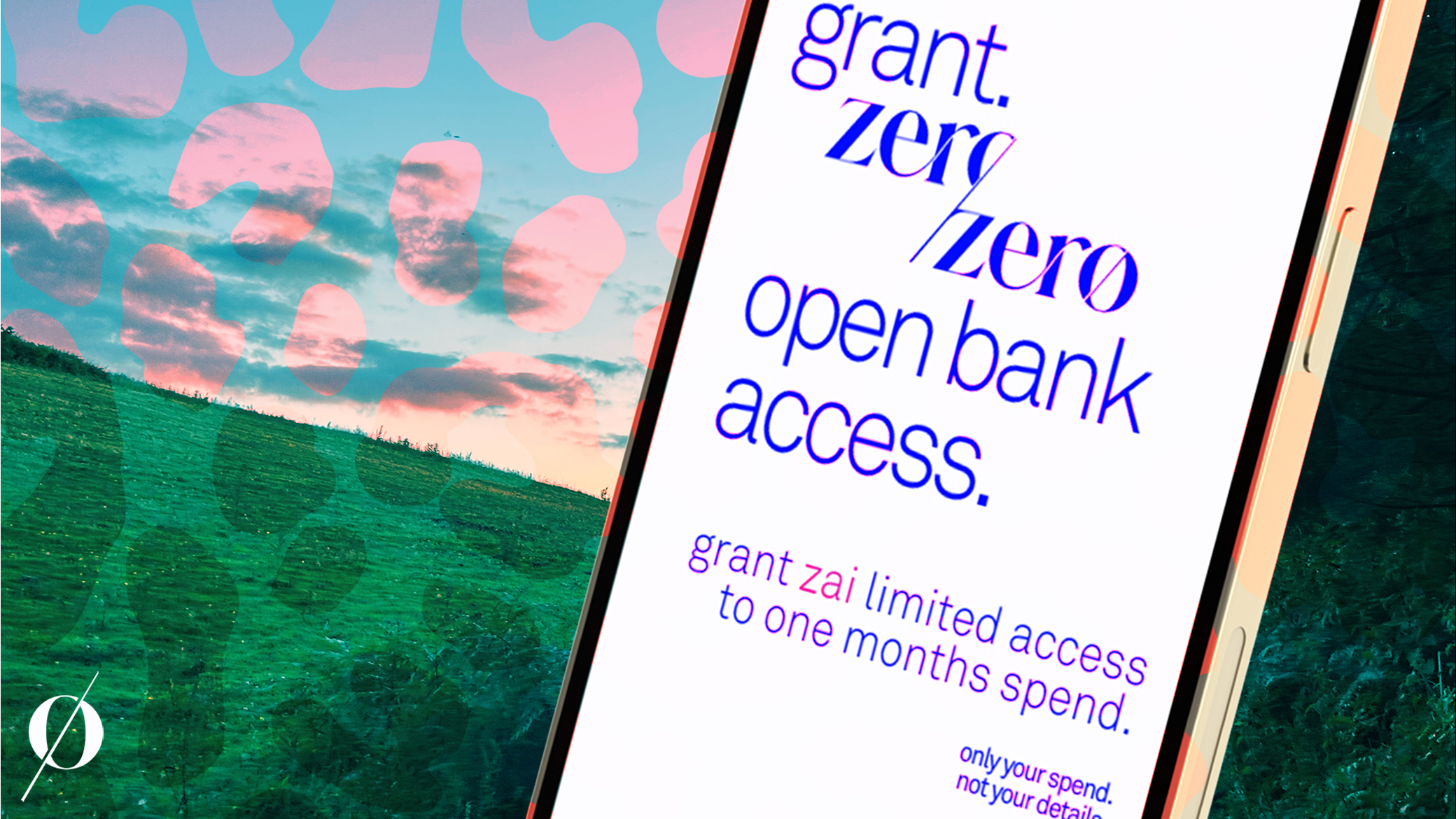
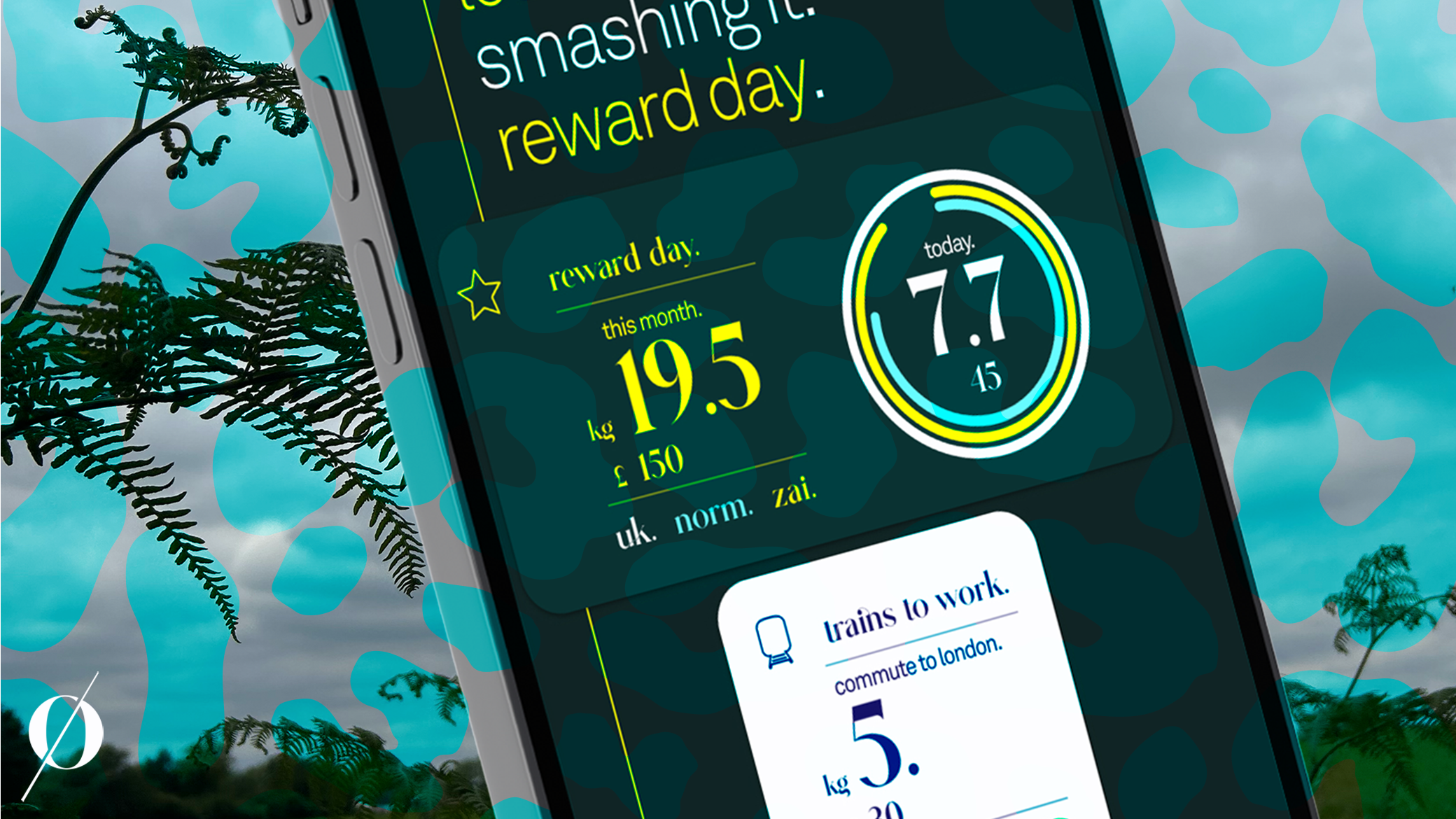
Carbon Footprint Tracking: Using GPS and open banking data to calculate impact effortlessly.
Gamified Goals: Encouraging users to stay engaged with rewards and progress tracking.
Seamless Navigation: Ensuring that every feature was easy to find and use, even for first-time users.
4. Lean Development.
Using an agile approach, we developed a robust MVP for Zero Zero. This included:
Prioritizing core functionalities to meet immediate user needs while leaving room for future scalability.
Prototyping and testing with real users to refine the app experience iteratively.
Integrating technologies like AI, GPS, and open banking to ensure the app delivered on its promises.
The Results.
We’re now live in test environments, learning fast, pivoting where users drop off, and solving real pain points through AI prototyping and adaptive design. It’s a journey, but one with a clear mission: to re-wild our relationship with the planet, starting with the small, everyday choices we all make.


The Brand.


Photography style.

Social Style.
