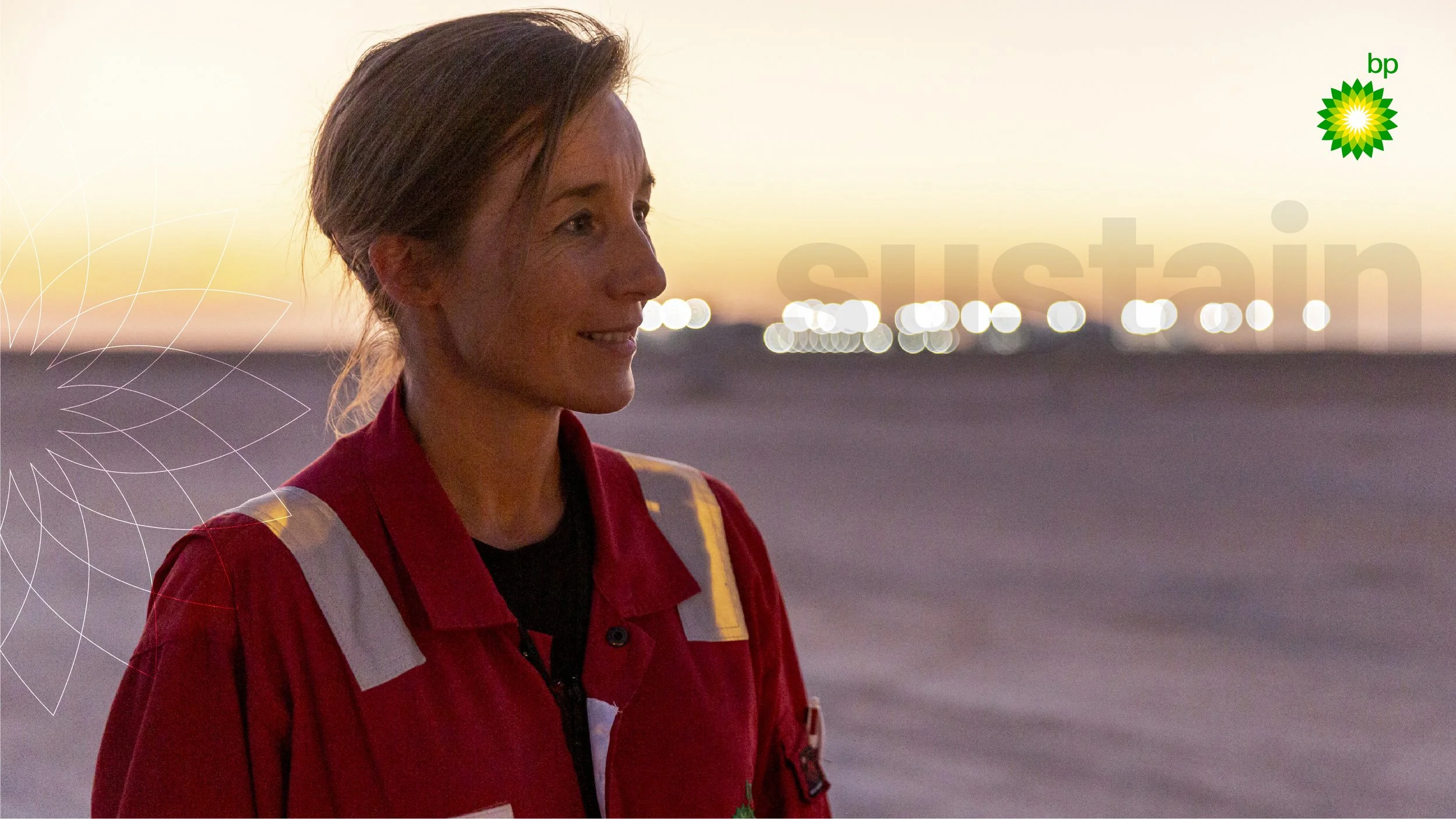
bp CarbonView.
Effectively report and develop insights on carbon activity from traded volumes.
The brief.
Deliver automation initiatives shifting from manual tasks of collecting, cleansing and standardising data to focus on analytics and insights - enabling our emission reduction targets
Build out the sustain platform foundations capability, consuming the output of our source data automation initiatives.
Deliver a seamless solution which will enable more accurate and faster reporting to drive actionable insight. And, what does the future look like?
The objective.
Deliver trusted, on-time data for Aim 3 reporting and actionable insights to drive interventions & decision-making.
The customers.
C&P and T&S key stakeholders helped shape our user personas and define our customers.
The problems.
Incomplete automation results in the risk of late or inaccurate reporting.
The vision.
Accessible, timely and trusted data and insights.
Reduce human error, design and tech debt.
The process.
Conducted a detailed discovery of the current process to identify pain points. Define the logical scope by working closely with the business, resulting in joined-up value delivery.
The solution.
Created a robust and adaptable UX and UI design system. Designed various workflows that assist the automation and governance process, and worked in short sprints to deliver the required features and functionality. And, the future vision.
Discovery.
I immersed myself across five BP business groups to research carbon emissions reporting, uncovering inconsistent tools, duplicate data entry, ambiguous designs, and broken processes from input through to sign-off.

Define.
Working closely with engineers and stakeholders, I defined a new real-time data capture system and designed streamlined workflows, transforming carbon reporting from manual entry through to submission and executive sign-off.

The teaser.
design.
Unambiguous design.

I stripped back the core design system to create simple, reusable components and a modular toolkit. The result was a clean, intuitive UI that made complex emissions data easy for VPs and senior management to understand, adjust, and sign off with confidence

UI Design.